How can the users see their stats
In this guide, you will learn how users can view their personal messaging statistics within the Ozeki SMS Gateway system. The built-in reporting tools available under the Charts menu provide clear insights into user activity, including message volume, frequency, and distribution. Whether you're monitoring usage trends or evaluating performance, these visual reports - available as bar charts, tables, and pie charts - help you understand your communication patterns effectively.
What is Ozeki SMS Gateway system?
Ozeki SMS Gateway is a professional messaging software designed for sending and receiving SMS messages from a computer or server. It provides a user-friendly interface and supports high-performance communication through mobile networks using GSM modems or internet-based SMS gateways. The system includes powerful tools such as contact management, message scheduling, delivery reports, and real-time charts. It is commonly used by businesses and organizations for marketing, notifications, customer service, and internal communication.
How can the users see their stats (Quick Steps)
- Open Ozeki SMS Gateway
- Click on the "Charts" menu
- View bar chart to see SMS traffic over time
- Switch to table view for detailed message count breakdown
- Select pie chart to view message distribution by recipient or sender
How can the users see their stats (Video tutorial)
In this video, you will discover how to check your personal SMS activity statistics using the Charts menu in Ozeki SMS Gateway. The tutorial demonstrates how to navigate to the reporting interface and switch between bar chart, table, and pie chart views. By the end of the video, you'll know how to access and interpret your message data for improved tracking and communication analysis.
Step 1 - Open reporting charts
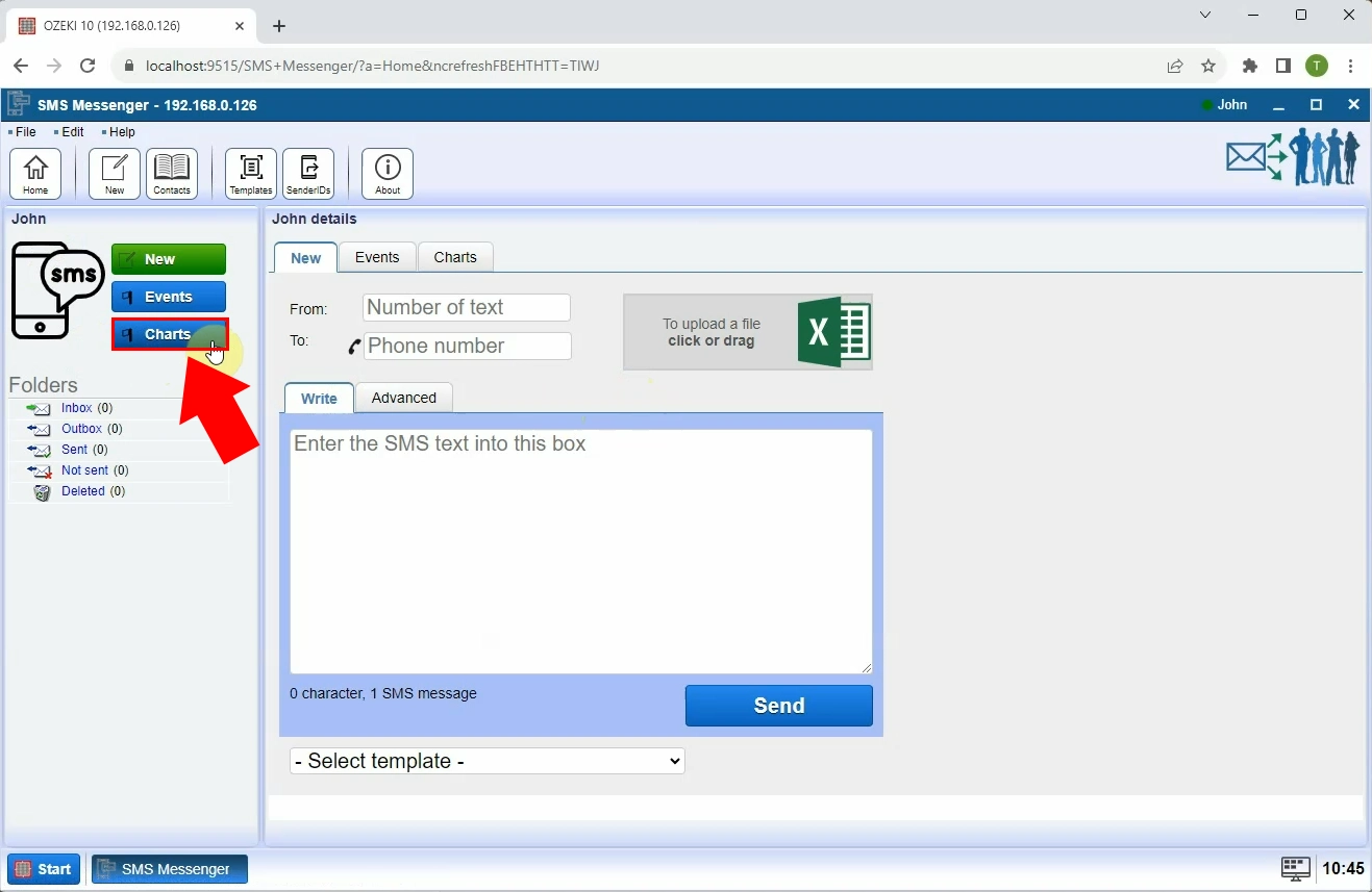
Open the Ozeki SMS Gateway application. In the main toolbar, click on the Charts menu. This section allows you to view statistics related to your messaging activity, such as the number of sent and received messages over time (Figure 1).

Step 2 - Display bar chart
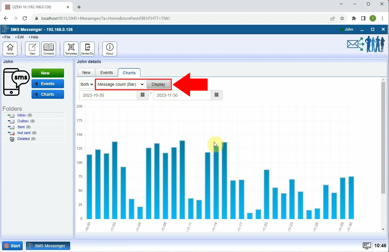
Once inside the Charts menu, the system will show a bar chart by default. This chart gives a visual representation of your message traffic and helps track patterns in SMS usage (Figure 2).

Step 3 - Display table
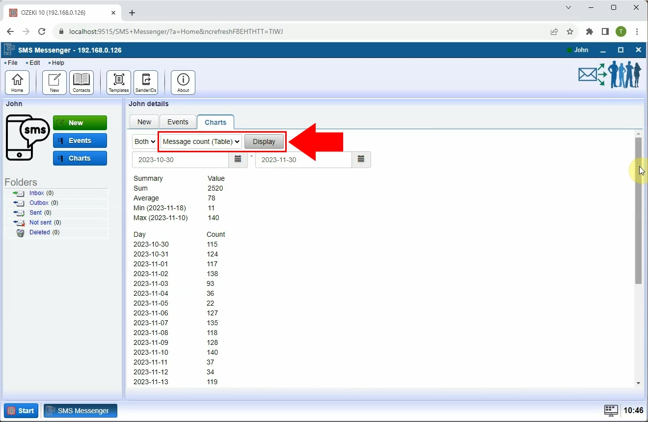
Select the Message count (Table) from the dropdown menu to display your messaging statistics in tabular format. This provides a more detailed breakdown of message counts, timestamps (Figure 3).

Step 4 - Display pie chart
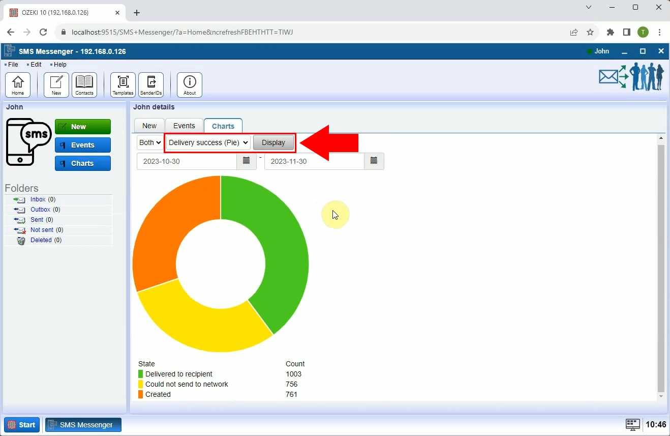
Switch to the pie chart view to see a proportional distribution of your messages - such as how many messages were sent per recipient or which user generated the most traffic. This view helps understand the spread of communication (Figure 4).

